Plot a Network Graph from DataFrame
MSTICPy has functions that let you convert a pandas DataFrame into a networkx graph or plot directly as a graph using Bokeh interactive plotting.
This uses underlying functionality from NetworkX and Bokeh
You pass the functions the column names for the source and target nodes to build a basic graph. You can also name other columns to be node or edge attributes. When displayed these attributes are visible as popup details courtesy of Bokeh’s Hover tool.
You can also opt to use different networkx layouts other than the
default spring layout.
Note: We use the term “”network graph” in this document. This is shortened to “graph” when used in the context of Networkx e.g. “a Networkx graph”.
# Import msticpy
import msticpy as mp
mp.init_notebook();

# Read in a DataFrame
proc_df = pd.read_csv("./data/processes_on_host.csv", index_col=0)
proc_df["Process"] = proc_df.NewProcessName.str.extract(r".*\\([^\\]+)")
proc_df.head(3)
Overview
You can create and display a DataFrame as a network graph using the
MSTICPy pandas accesssor
mp_plot.network.
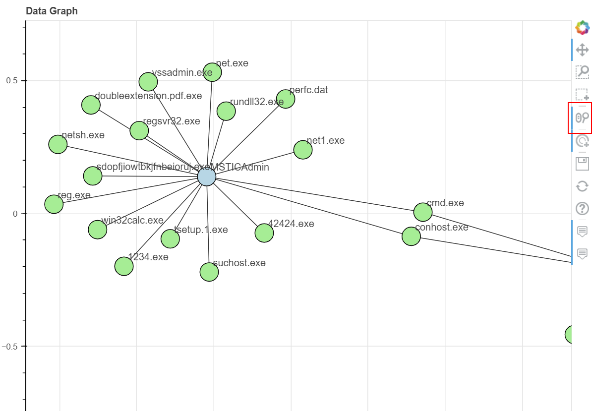
Below is an example featuring process creation events using the SubjecUserName and Process name as nodes. Node and edge attributes are taken from other DataFrame columns.
Tip
use the WheelZoom tool to use the mouse scroll wheel to zoom in and out of the plot. The button to enable/disable the WheelZoom tool is highlighted in illustration below.
proc_df.head(100).mp_plot.network(
    source_col="SubjectUserName",
    target_col="Process",
    source_attrs=["SubjectDomainName", "SubjectLogonId"],
    target_attrs=["NewProcessName", "ParentProcessName", "CommandLine"],
    edge_attrs=["TimeGenerated"],
)
Creating a NetworkX Graph from a DataFrame
The mp.to_graph
accessor will generate a NetworkX graph from the
input data. This is a method that is automatically added to DataFrames by MSTICPy.
You can supply the following parameters:
source_col - Column for source nodes.
target_col - Column for target nodes.
source_attrs - Optional list of columns to use as source node attributes, by default None
target_attrs - Optional list of columns to use as target node attributes, by default None
edge_attrs - Optional list of columns to use as edge node attributes, by default None
graph_type - “graph” or “digraph” (for nx.DiGraph)
It returns a NetworkX graph that you can perform graph analyses on such as extracting subgraphs, analyzing connectedness, etc See the NetworkX documentation for more details.
Create the NX graph.
nx_graph = proc_df.mp.to_graph(
    source_col="SubjectUserName",
    target_col="Process"
)
Show the number of nodes and edges.
print("# nodes:", len(nx_graph.nodes()))
print("# edges:", len(nx_graph.edges()))
# nodes: 65
# edges: 67
Display a node showing the default attributes.
nx_graph.nodes["MSTICAdmin"]
{'node_role': 'source', 'node_type': 'SubjectUserName'}
Use the nx.neighbors function to show the nodes directly
connected to this node.
import networkx as nx
# Show neighbors of a node - which processes where executed by this account
list(nx.neighbors(nx_graph, "MSTICAdmin"))[:15]
['reg.exe',
 'cmd.exe',
 'rundll32.exe',
 '42424.exe',
 '1234.exe',
 'tsetup.1.exe',
 'netsh.exe',
 'perfc.dat',
 'sdopfjiowtbkjfnbeioruj.exe',
 'doubleextension.pdf.exe',
 'vssadmin.exe',
 'conhost.exe',
 'net.exe',
 'net1.exe',
 'regsvr32.exe']
Adding node and edge attributes.
nx_graph = proc_df.mp.to_graph(
    source_col="SubjectUserName",
    target_col="Process",
    source_attrs=["SubjectDomainName", "SubjectLogonId"],
    target_attrs=["NewProcessName", "ParentProcessName", "CommandLine"],
    edge_attrs=["TimeGenerated"],
)
Display the node with added attributes.
nx_graph.nodes["MSTICAdmin"]
{'SubjectDomainName': 'MSTICAlertsWin1',
 'SubjectLogonId': '0xfaac27',
 'node_role': 'source',
 'node_type': 'SubjectUserName'}
Instead of using the pandas accessor, you can import and use
the underlying function
df_to_networkx. This has the same
functionality as the pandas accessor method.
msticpy.transform.network.df_to_networkx

nx_graph = df_to_networkx(
    data=proc_df,
    source_col="SubjectUserName,
    target_col="Process"
)
Built-in Networkx Plotting
You can use the matplotlib built-in networkx plotting backend. You can also use NetworkX functions to export the graph to a variety of more flexibly visualization tools such as GraphViz.
nx.draw(nx_graph)
Plotting a Network Graph
Using Bokeh plotting gives you interactivity as well as a more informative and richer display.
You can build and plot a graph in a single operation using the
mp_plot.network
accessor method.
Use the standard Bokeh tools on the created plot to select nodes and edges, to zoom and pan around the network graph and to hover over elements to reveal attribute values.
Note
Bokeh graph plotting does not support interactive dragging of nodes and recalculation of the layout.
proc_df.head(70).mp_plot.network(
    source_col="ParentProcessName",
    target_col="Process"
)
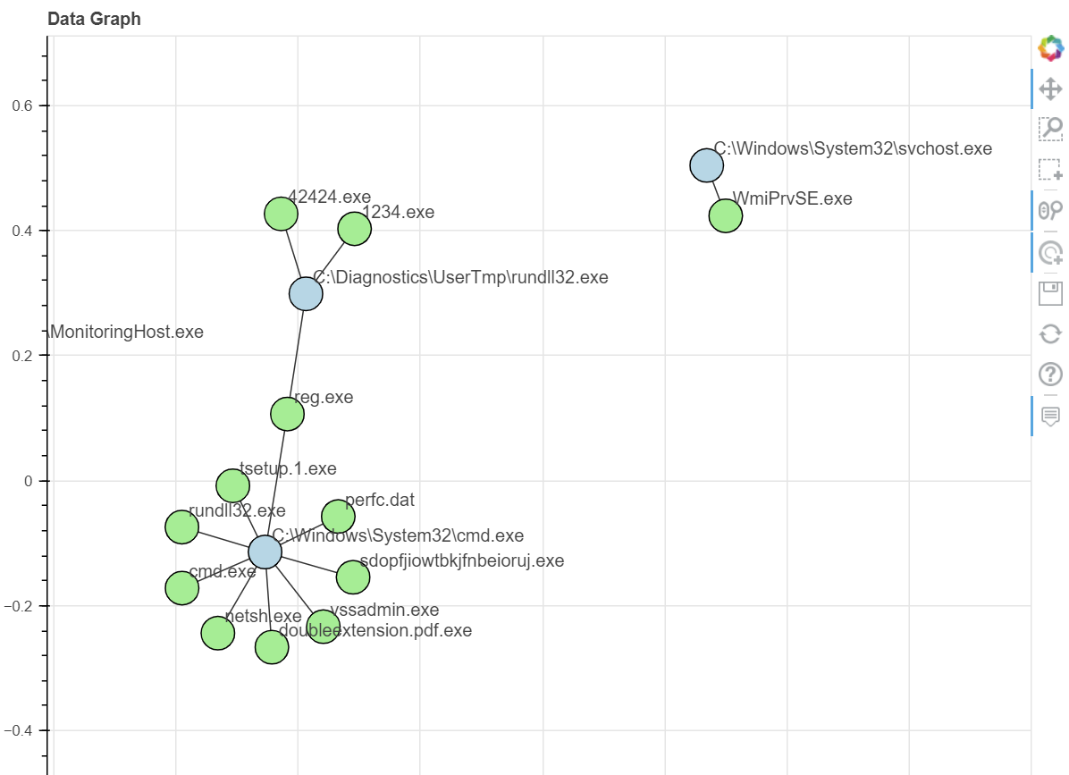
This has the same options as the np.to_graph accessor method:
source_col - Column for source nodes.
target_col - Column for target nodes.
source_attrs - Optional list of columns to use as source node attributes, by default None
target_attrs - Optional list of columns to use as target node attributes, by default None
edge_attrs - Optional list of columns to use as edge node attributes, by default None
graph_type - “graph” or “digraph” (for nx.DiGraph)
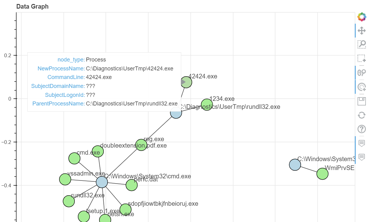
In this case, they also cause the node and edge attributes to be displayed on the plot using the Bokeh HoverTool. Moving the mouse cursor over a node or edge will display the attributes.
Note the attributes for source and target nodes are both shown with the HoverTool but only the values of populated attributes for that node type (source or target) are shown.
proc_df.head(70).mp_plot.network(
    source_col="ParentProcessName",
    target_col="Process",
    source_attrs=["SubjectDomainName", "SubjectLogonId"],
    target_attrs=["NewProcessName", "ParentProcessName", "CommandLine"],
    edge_attrs=["TimeGenerated"],
)
There are a number of other parameters to control the display of the graph.
title - Title for the plot, by default ‘Data Graph’
node_size - Size of the nodes in pixels, by default 25
font_size - Font size for node labels, by default 10. Can be an integer (point size) or a string (e.g. “10pt”)
width - Plot width in pixels, by default 800
height - Plot height (the default is 800)
plot scale - Position scale (the default is 2)
hide - Don ‘t show the plot, by default False. If True, just return the figure.
source_color - The color of the source nodes, by default ‘light-blue’
target_color - The color of the source nodes, by default ‘light-green ‘
edge_color - The color of the edges, by default ‘black’
node_size - Size of the nodes in pixels, by default 25
font_size - Font size for node labels, by default 10. Can be an integer (point size) or a string (e.g. “10pt”)
**kwargs - other keyword arguments will be passed to the Networkx layout function.