Matrix Plot
The matrix plot is designed to show interactions between two sets of items (columns in a pandas DataFrame) in a x-y grid.
For example, if you have a DataFrame with source and destination IP addresses (such as a firewall log), you can plot the source IPs on the y axis and destination IPs on the x axis. Where there is an event (row) that links a given source and destination the matrix plot will plot a circle.
By default the circle is proportional to the number of events containing a given source/destination (x and y).
The matrix plot also has the following variations:
You can use a named column from the input data (e.g. bytes transmitted) to control the size of the plotted circle.
You can invert the circle plot size, so that rarer interactions are shown with a large intersection point.
You can plot just the presence of one or more interactions - this plots a fixed-size point and is useful if you only want to see the presence/ absence of an interaction but don’t care about the number of interactions.
You can use a count of distinct values to control the size (e.g. you might specify protocol as the value column and want to see how many distinct protocols the source/destination interacted over).
You can plot the log of any of the above counts/size - this is useful if the variance in the size is orders of magnitude.
Sample data
A look at the top 3 rows of our sample data.
net_df.head(3)
SourceIP |
L7Protocol |
TotalAllowedFlows |
DestinationIP |
|---|---|---|---|
20.38.98.100 |
https |
1 |
65.55.44.109 |
13.67.143.117 |
https |
1 |
13.71.172.130 |
65.55.163.76 |
https |
5 |
13.65.107.32 |
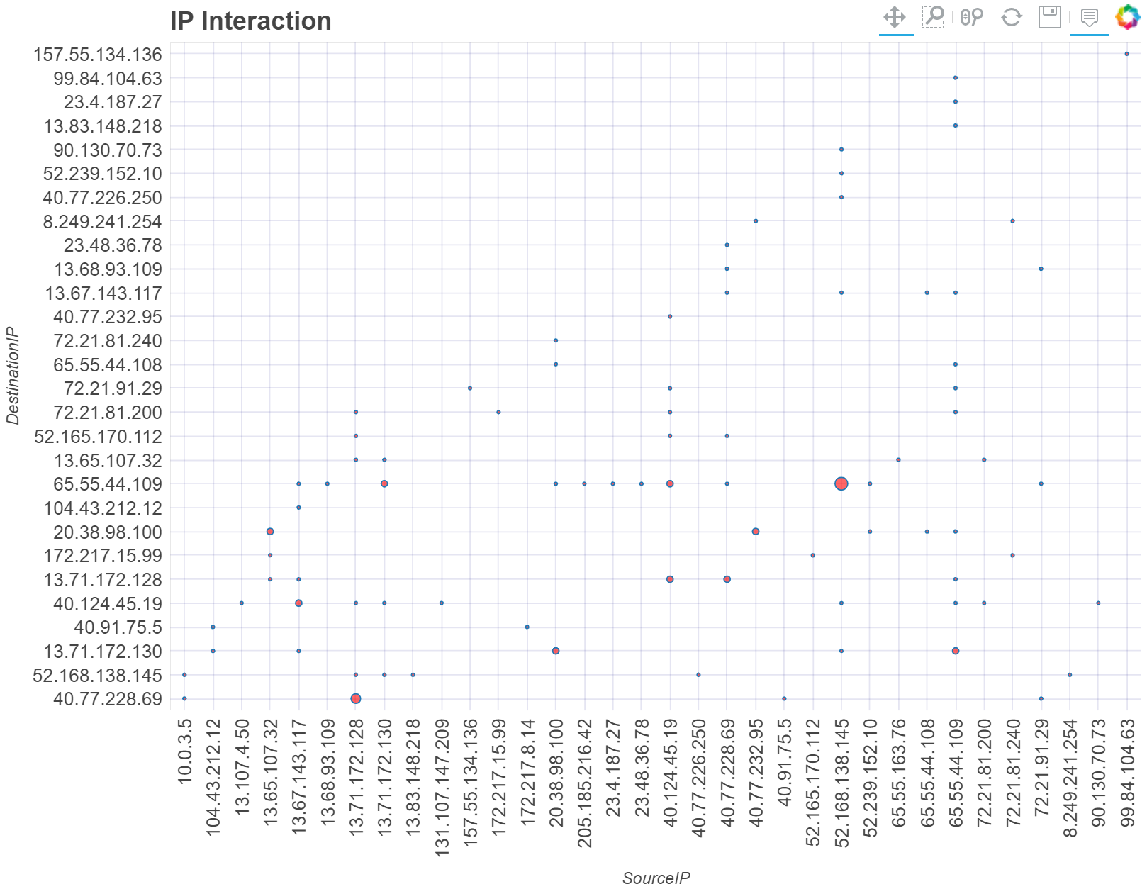
The basic matrix/interaction plot
The basic matrix plot displays a circle at each interaction between the X and Y axes items. The size of the circle is proportional to the number of records/rows in which the X and Y parameter interact.
Here we are using MSTICPy pandas accessor to plot the graph directly
from the DataFrame.
See mp_plot.matrix
net_df.mp_plot.matrix(x="SourceIP", y="DestinationIP", title="IP Interaction")
Tip
Using the Bokeh interactive tools
The Bokeh graph is interactive. The toolbar lets you toggle the interactive tools: Panning, Select zoom, Mouse wheel zoom, Reset to default view, Save image to PNG, Hover tool.
If the Hover tool is enabled a tooltip will display some properties of the intersecting point as you hover the mouse over that point.
Sorting the X and Y values
You can use the sort parameter to sort both axes or sort_x and
sort_y to individually sort the values.
The sort parameters take values “asc” (ascending), “desc” (descending),
True (ascending). None and False produce no sorting.
Note
Bokeh automatically sorts the X axis labels in ascending order. You can override this with sort_x=”desc” but it is not possible to display the x axis in unsorted (DataFrame) order.
net_df.mp_plot.matrix(
    x="SourceIP",
    y="DestinationIP",
    title="IP Interaction",
    sort="asc"
)
Using the plot_matrix function directly
Although it is usually more convenient to plot directly from the DataFrame
accessor function (df.mp_plot.matrix), you can also import the
native function plot_matrix
and use that.
It has the same syntax as the pandas extension except that you must supply
the input DataFrame as the first parameter (or as the named parameter
data)
from msticpy.vis.matrix_plot import plot_matrix

plot_matrix(data=net_df, x="SourceIP", y="DestinationIP", title="IP Interaction")
Plotting interactions based on column value
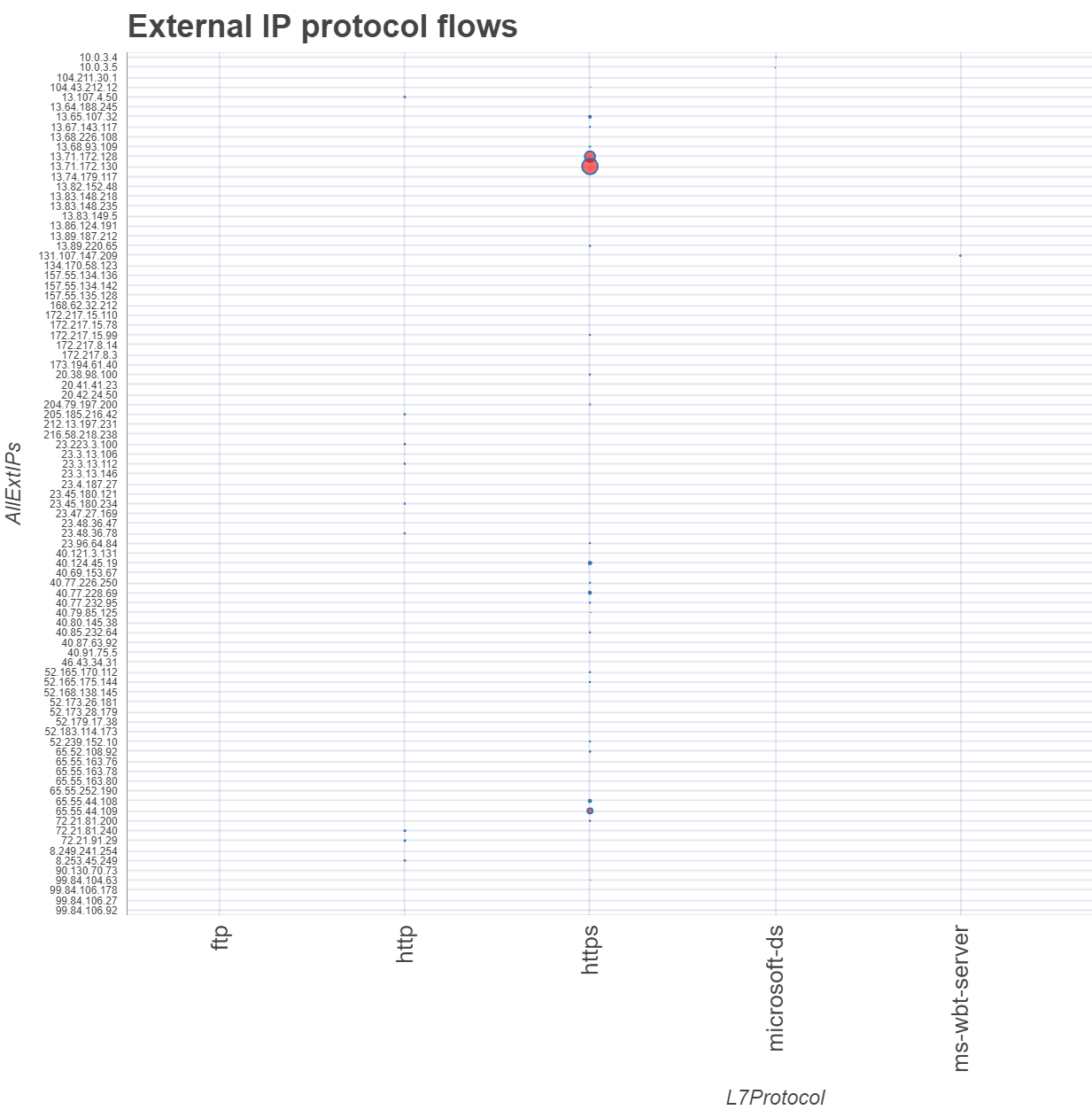
The default behavior of the matrix plot is simply to count the number of rows in which a given pair of X-Y items occur. The circle linking the X and Y entities is sized in proportion to this count.
You can also use a numeric column in the input DataFrame to control this sizing. For network data you might choose BytesTransmitted or something similar.
In this example, we’re using the TotalAllowedFlows column.
Note
Because there is a very large variance in the values of this column, the small values have been scaled to a very small size. We address this in the next selection
all_df.mp_plot.matrix(
    x="L7Protocol",
    y="AllExtIPs",
    value_col="TotalAllowedFlows",
    title="External IP protocol flows",
    sort="asc",
)
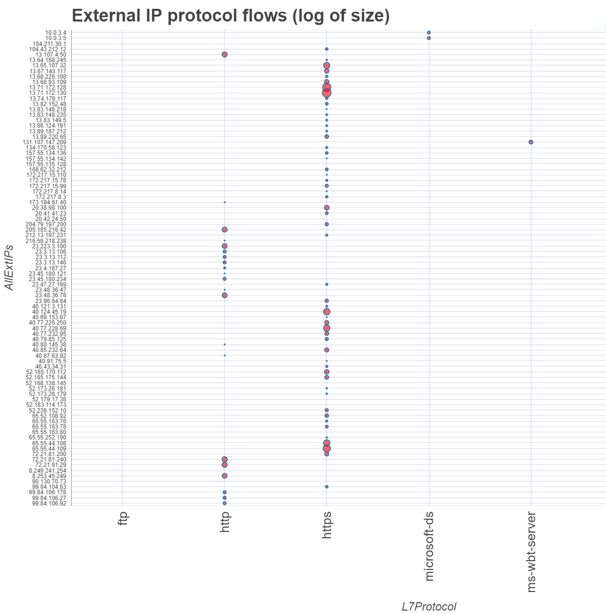
Log scaling the value/size column
We saw how, in the previous example, the presence of a few large values makes many of the interaction points difficult to see. We can change this by plotting the log (natural log) of the scalar values using the log_size=True parameter.
all_df.mp_plot.matrix(
    x="L7Protocol",
    y="AllExtIPs",
    value_col="TotalAllowedFlows",
    title="External IP protocol flows (log of size)",
    log_size=True,
    sort="asc",
)
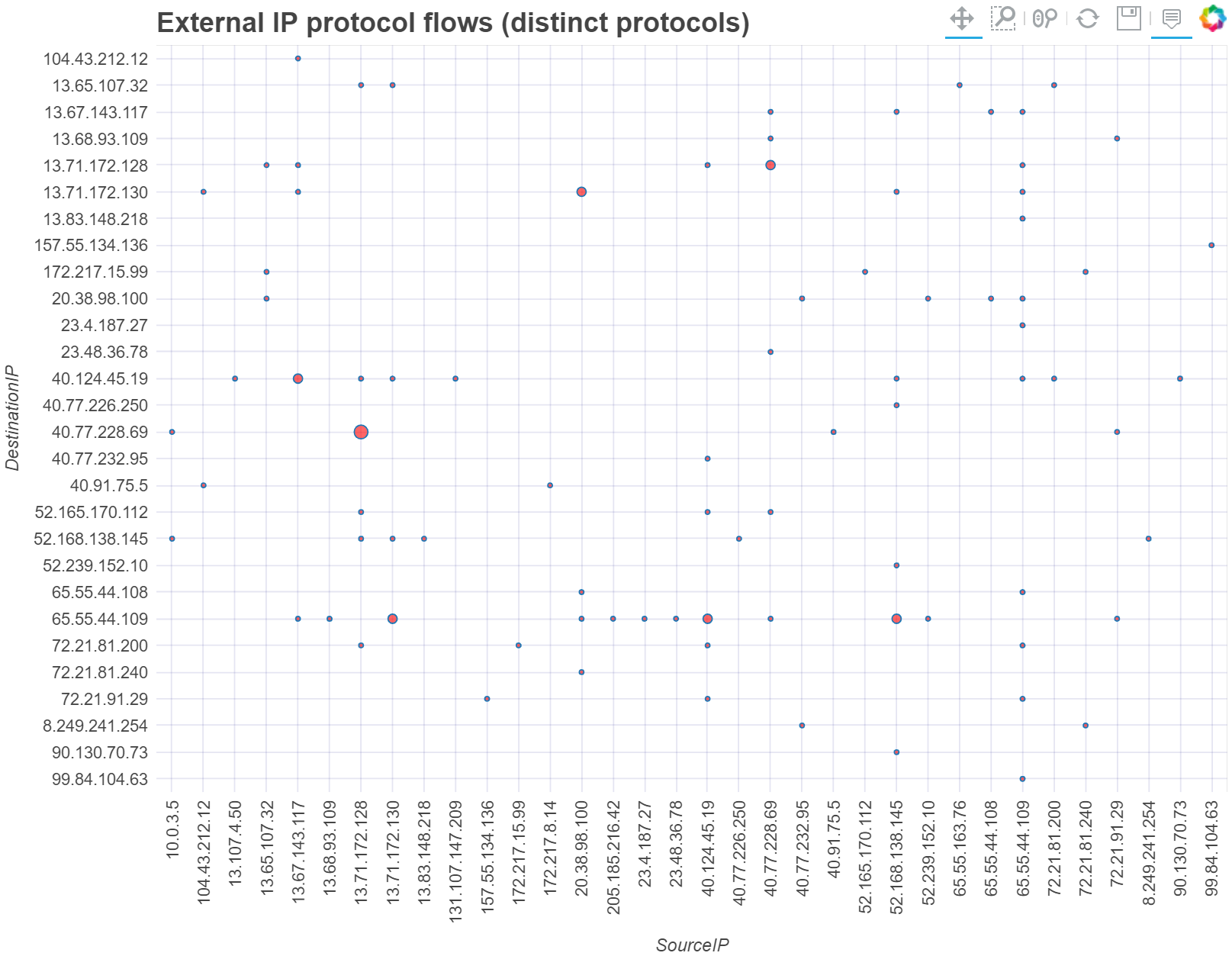
Size based on number of distinct values
Using the dist_count=True parameter lets us use non-numeric values
as the value_col. In this case the display size is based on number
of distinct values in the value_col column.
The plot below plots the circle size from the number of distinct Layer 7 protocols used between the endpoints.
net_df.mp_plot.matrix(
    x="SourceIP",
    y="DestinationIP",
    value_col="L7Protocol",
    dist_count=True,
    title="External IP flows (distinct protocols)",
    sort="asc",
    max_label_font_size=9,
)
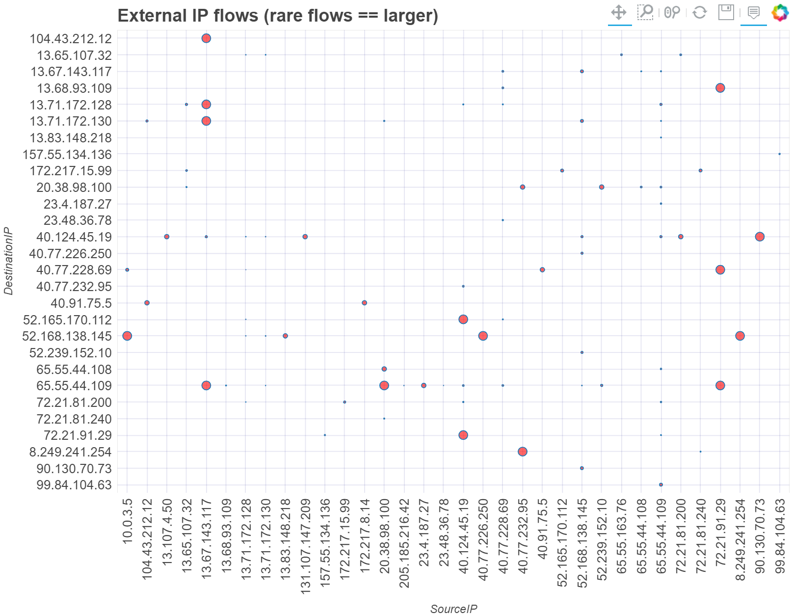
Inverting the size to show rare interactions
Where you want to highlight unusual interactions, you can plot the
inverse of the value_col value or count of interactions using the
invert=True parameter.
This results in a plot with larger circles for rarer interactions.
net_df.mp_plot.matrix(
    x="SourceIP",
    y="DestinationIP",
    value_col="TotalAllowedFlows",
    title="External IP flows (rare flows == larger)",
    invert=True,
    sort="asc",
)
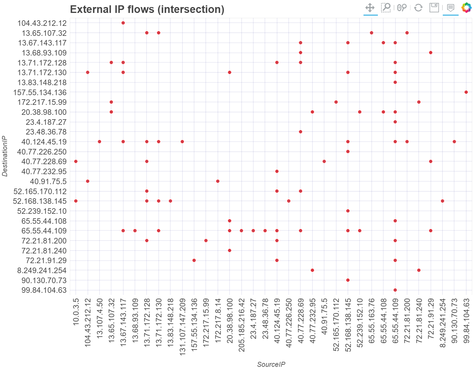
Showing interactions only
Where you do not care about any value associated with the interaction
and only want to see if there has been an interaction, you can use the
intersect parameter
net_df.mp_plot.matrix(
    x="SourceIP",
    y="DestinationIP",
    title="External IP flows (intersection)",
    intersect=True,
    sort="asc",
)