Event Timeline
This document describes the use of the interactive timeline controls built using the Bokeh library.
There are two chart controls types:
- Discrete event series - this plots multiple series of events as discrete glyphs
- Event value series - this plots a scalar value of the events using glyphs, bars or traditional line graph (or some combination).
A sample notebook demonstrating the use of these plot controls is available here Event Timeline Usage Notebook
Discrete Event Timelines
Plotting a simple timeline
The display_timeline function (see
display_timeline) takes three main
parameters:
- data - the data to plot. This can be either a pandas DataFrame or a dictionary of data sets (see Plotting series from different data sets later.)
- time_column - the name of the data column in the data to use as the chart x axis.
- source_columns - a list of column names used to populate the hovertool, which shows the values of these columns as a tooltip, when you hover over each point with a mouse.
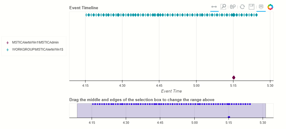
This code shows an example of createing a simple plot, with a single time series.
processes_on_host = pd.read_csv('data/processes_on_host.csv',
                                parse_dates=["TimeGenerated"],
                                infer_datetime_format=True)

# At a minimum we need to pass a dataframe with data
nbdisplay.display_timeline(processes_on_host)

The Bokeh graph is interactive and has the following features:
Tooltip display for each event marker as you hover over it
Toolbar with the following tools described in the order shown:
- Panning
- Select zoom
- Mouse wheel zoom
- Reset to default view
- Save image to PNG
- Hover tool
Most of these are toggles, enabling or disabling the tool.
Additionally an interactive timeline navigation bar is displayed below the main chart. You can change the timespan shown on the main chart by dragging or resizing the selected area on this navigation bar. You can also use the Bokeh panning and zoom tools directly on the main chart.
Note
The tooltips work on the Windows process data shown above
because of a legacy fallback built into the code. Usually, you must
specify the source_columns parameter explicitly to have the hover
tooltips populated correctly.
More Advanced Timelines
display_timeline also takes a number of optional parameters that
give you more flexibility to show multiple data series and change the
way the graph appears.
See display_timeline Documentation
for a description of all of the parameters.
Grouping Series From a Single DataFrame
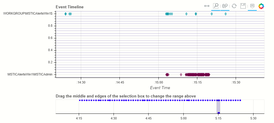
nbdisplay.display_timeline(processes_on_host,
                           group_by="Account",
                           source_columns=["NewProcessName",
                                           "ParentProcessName"],
                           legend="inline");
We can use the group_by parameter to specify a column on which to split individually plotted series.
Specifying a legend, we can see the value of each series group. The legend is interactive - click on a series name to hide/show the data. The legend can also be placed outside of the graph specifying “left” or “right”.
Specifying a legend, we can see the value of each series group. The legend is interactive - click on a series name to hide/show the data. The legend can be placed inside of the chart (legend=”inline”) or to the left or right.
Note
the trailing semicolon just prevents Jupyter showing the return value from the function. It isn’t mandatory.
Alternatively we can enable the yaxis - although this is not guaranteed to show all values of the groups.
nbdisplay.display_timeline(processes_on_host,
                           group_by="Account",
                           source_columns=["NewProcessName", "ParentProcessName"],
                           yaxis=True);
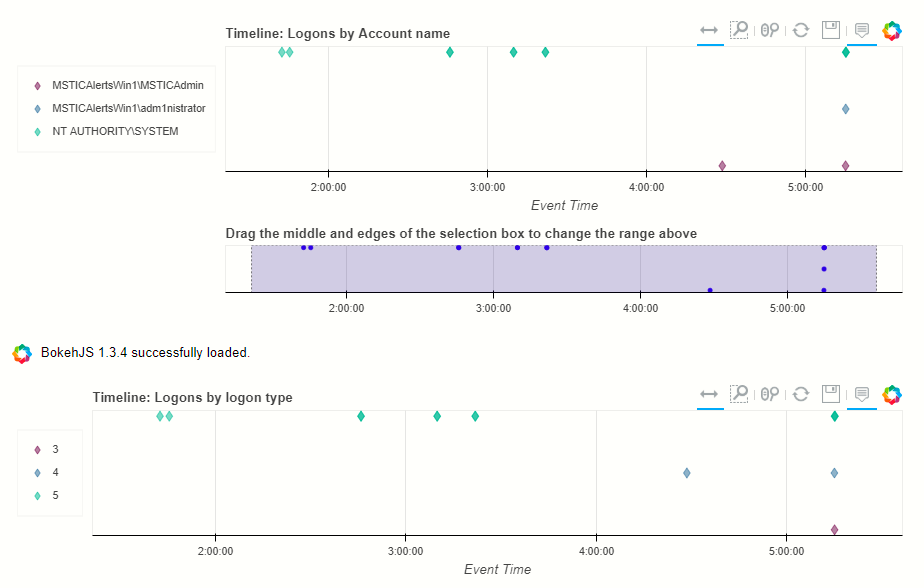
Two other examples using logon events.
nbdisplay.display_timeline(host_logons,
                           title="Logons by Account name",
                           group_by="Account",
                           source_columns=["Account",
                                           "TargetLogonId",
                                           "LogonType"],
                           legend="left",
                           height=200);

nbdisplay.display_timeline(host_logons,
                           title="Logons by logon type",
                           group_by="LogonType",
                           source_columns=["Account",
                                           "TargetLogonId",
                                           "LogonType"],
                           legend="left",
                           height=200,
                           range_tool=False);
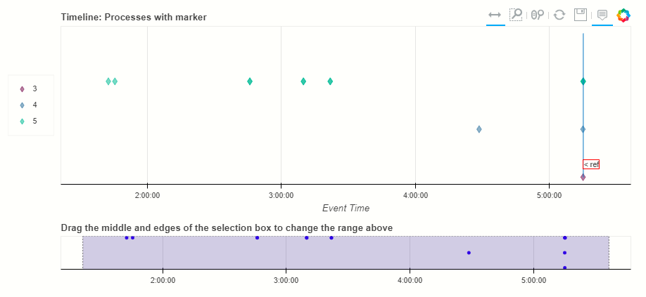
Displaying a reference line
If you have a single item (e.g. an alert) that you want to show as a reference point on the graph you can pass a datetime value, or any object that has a TimeGenerated or StartTimeUtc property.
If the object doesn’t have one of these, just pass the property as the ref_time parameter.
# pull out a sample row to use as a reference marker
fake_alert = processes_on_host.sample().iloc[0]

nbdisplay.display_timeline(host_logons,
                           title="Processes with marker",
                           group_by="LogonType",
                           source_columns=["Account", "TargetLogonId", "LogonType"],
                           ref_event=fake_alert,
                           legend="left");
Plotting series from different data sets
When you want to plot data sets with different schema on the same plot
it is difficult to put them in a single DataFrame. To do this we need to
assemble the different data sets into a dictionary and pass that to the
display_timeline
The dictionary has this format:
Key (str) - Name of data set to be displayed in legend
Value (Dict[str, Any]) - containing:
    data (pd.DataFrame) - Data to plot
    time_column (str, optional) - Name of the timestamp column
    source_columns (list[str], optional) - source columns to use
        in tooltips
    color (str, optional) - color of datapoints for this data
If any of the last values are omitted, they default to the values
supplied as parameters to the function (see below)
This example shows creating this dictionary. Notice that source_columns
parameter for each series is different. The source column set used is the
union of all of the individual sets so some items will display “???” If
the source data does not have a column corresponding to one or more of the
names.
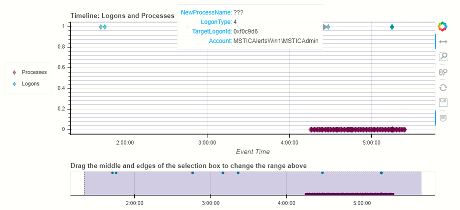
procs_and_logons = {
    "Processes" : {"data": processes_on_host, "source_columns": ["NewProcessName", "Account"]},
    "Logons": {"data": host_logons, "source_columns": ["Account", "TargetLogonId", "LogonType"]}
}

nbdisplay.display_timeline(data=procs_and_logons,
                           title="Logons and Processes",
                           legend="left");
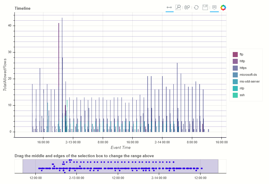
Plotting Series with Scalar Values
Often you may want to see a scalar value plotted with the series.
The example below uses display_timeline_values to plot network flow
data using the total flows recorded between a pair of IP addresses.
Note that the majority of parameters are the same as
display_timeline but include a mandatory y parameter which
indicates which value you want to plot on the y (vertical) axis.
See display_timeline_values documentation
for a description of all of the parameters.
az_net_flows_df = pd.read_csv('data/az_net_flows.csv',
                          parse_dates=["TimeGenerated", "FlowStartTime", "FlowEndTime"],
                          infer_datetime_format=True)

flow_plot = nbdisplay.display_timeline_values(data=az_net_flows_df,
                                  group_by="L7Protocol",
                                  source_columns=["FlowType",
                                                  "AllExtIPs",
                                                  "L7Protocol",
                                                  "FlowDirection",
                                                  "TotalAllowedFlows"],
                                  time_column="FlowStartTime",
                                  y="TotalAllowedFlows",
                                  legend="right",
                                  height=500);
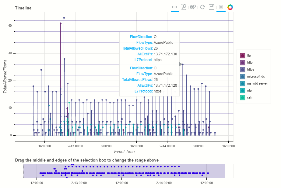
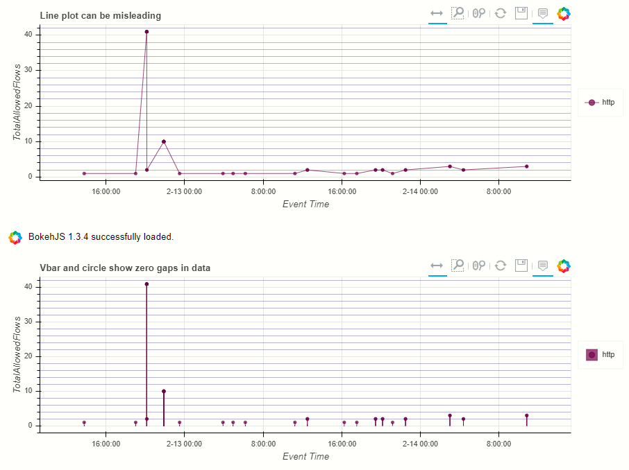
By default the plot uses vertical bars show the values but you can use
any combination of vbar, circle and line, using the kind parameter.
You specify the plot types as a list of strings (all lowercase).
Including “circle” in the plot kinds makes it easier to see the hover value.
flow_plot = nbdisplay.display_timeline_values(data=az_net_flows_df,
                                              group_by="L7Protocol",
                                              source_columns=["FlowType",
                                                              "AllExtIPs",
                                                              "L7Protocol",
                                                              "FlowDirection",
                                                              "TotalAllowedFlows"],
                                              time_column="FlowStartTime",
                                              y="TotalAllowedFlows",
                                              legend="right",
                                              height=500,
                                              kind=["vbar", "circle"]
                                            );
The line plot can be a bit misleading since it will plot lines between adjacent data points of the same series, implying that there is a gradual change in the value being plotted - even though there may be no data between the times of these adjacent points. For this reason using vbar is often a more accurate view. Compare the following two plots.
Exporting Plots as PNGs
To use bokeh.io image export functions you need selenium, phantomjs and
pillow installed:
conda install -c bokeh selenium phantomjs pillow
or
pip install selenium pillow
npm install -g phantomjs-prebuilt
For phantomjs downloads see phantomjs.org.
Once the prerequisites are installed you can create a plot and save the
return value to a variable. Then export the plot using export_png
function.
from bokeh.io import export_png
from IPython.display import display, Image, Markdown

# Create a plot
flow_plot = nbdisplay.display_timeline_values(data=az_net_flows_df,
                                              group_by="L7Protocol",
                                              source_columns=["FlowType",
                                                              "AllExtIPs",
                                                              "L7Protocol",
                                                              "FlowDirection",
                                                              "TotalAllowedFlows"],
                                              time_column="FlowStartTime",
                                              y="TotalAllowedFlows",
                                              legend="right",
                                              height=500,
                                              kind=["vbar", "circle"]
                                            );

# Export
file_name = "plot.png"
export_png(flow_plot, filename=file_name)

# Read it and show it
display(Markdown(f"## Here is our saved plot: {file_name}"))
Image(filename=file_name)